When a Map Became More Than a Picture of Place
A map is more than a picture of place: learn to read its omissions and purpose, so you can see what its neat lines leave outside the frame.
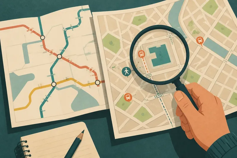
A bus map folds into a jacket pocket, its colored routes bright against a pale street grid. At a glance, it seems to show the city. Look closer and the map is really offering a particular answer: how to move between stops. That distinction changes how we read maps—and how we use them to think.
Purpose shapes the view
A map is a selection, not a miniature copy of a place. Someone chooses what to include, what to simplify, and what deserves the strongest visual emphasis. Those choices make the map useful for one task and incomplete for others.
A transit map may straighten a winding road so routes are easier to follow. A hiking map may give more space to trails and elevation than to shops. Neither is simply more truthful. Each directs attention toward a different practical question.
When you pick up a map, ask what action it is designed to support. Finding a bus connection, judging a walk, and understanding who can reach a public building are different tasks. The map’s purpose helps explain its shape—and signals what it may not tell you.
Read the omissions
Absence can be easy to mistake for insignificance. A blank area might mean open land, but it could also mark a missing layer, an area outside the map’s scope, or a feature the mapmaker chose not to show. A thin boundary can carry more practical weight than a bright landmark.
Look at the legend, scale, date or edition, and the map’s stated coverage. Notice whether it names private roads, informal paths, bus stops, entrances, or barriers. These details help distinguish “not shown” from “not there.”
Also notice whose movement is made simple. A route may appear direct while stairs, a locked gate, or a difficult crossing makes it inaccessible to some travelers. The map might answer where a destination sits without showing whether everyone can reach it in the same way.
Symbols have consequences
Color and line weight are not decoration alone. A thick route catches the eye; a pale side street recedes. A large symbol can make a small facility seem central, while an unlabeled entrance may disappear from view. Visual hierarchy quietly suggests what matters.
This does not mean every map hides an agenda. Often, space is limited and symbols must be simplified. Still, the result shapes a reader’s sense of distance, importance, and connection. A map can make two places feel close because the route is prominent, even when the walk between them is less straightforward than the graphic suggests.
When a symbol seems clear, check what the legend says it means. A dotted line could indicate a trail, a boundary, or a proposed route, depending on the map. Familiar-looking marks are not universal language.
Compare the frames
One useful way to understand a place is to set two maps beside each other. Choose maps of the same area made for different purposes, such as a transit diagram and a street map. Look for what each makes easy to see, then note what becomes faint or disappears.
Say you are choosing a library for an afternoon visit. A transit map shows a stop nearby, while a street map shows the entrance on the far side of a large block. The first helps you plan the ride; the second raises a question about the final walk. Checking both gives you a fuller picture without asking either map to do every job.
For a creative exercise, compare a printed map with a route app. One may emphasize named streets and landmarks; the other may foreground a suggested path and travel time. Instead of deciding which one is correct, ask what each invites you to notice and what assumptions its format carries.
What should you ask?
Why do maps leave things out?
Maps have limited space and a defined purpose, so they simplify. An omission may also reflect a data source or a choice about what counts as relevant, which is why the legend and coverage matter.
Can a map be biased?
Yes: selection, labels, scale, and visual emphasis can make some features seem central and others peripheral. Bias does not require deliberate deception; it can arise from the map’s intended use and the decisions made to serve it.
How can I tell what a map is for?
Check its title, legend, publisher, coverage, and the details it gives the most space. Then ask what decision a reader could make from it and which related decisions would require another source.
Should I trust a digital map over a printed one?
Neither format is automatically more complete. Digital maps can display changing layers, while printed maps offer a fixed view; both depend on the information selected and how clearly it is presented.
Keep the useful limits
It is not worth searching every map for a hidden meaning. For a simple trip, the route and stop names may be all you need. The habit matters when the map is guiding a larger decision or when an apparent absence could change what you do.
When a map is more than a picture of place, it becomes a record of priorities as well as geography. Read the lines, but also ask what task they serve, whose movement they clarify, and what you would need to know beyond the frame. That small pause can turn a map from an unquestioned answer into a more useful question.